Keith Richards
Whisky Label Concept
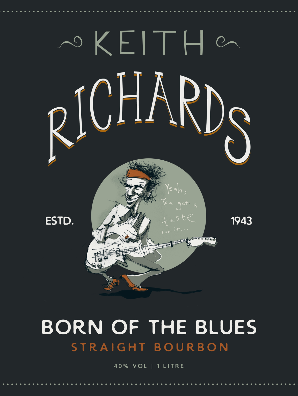
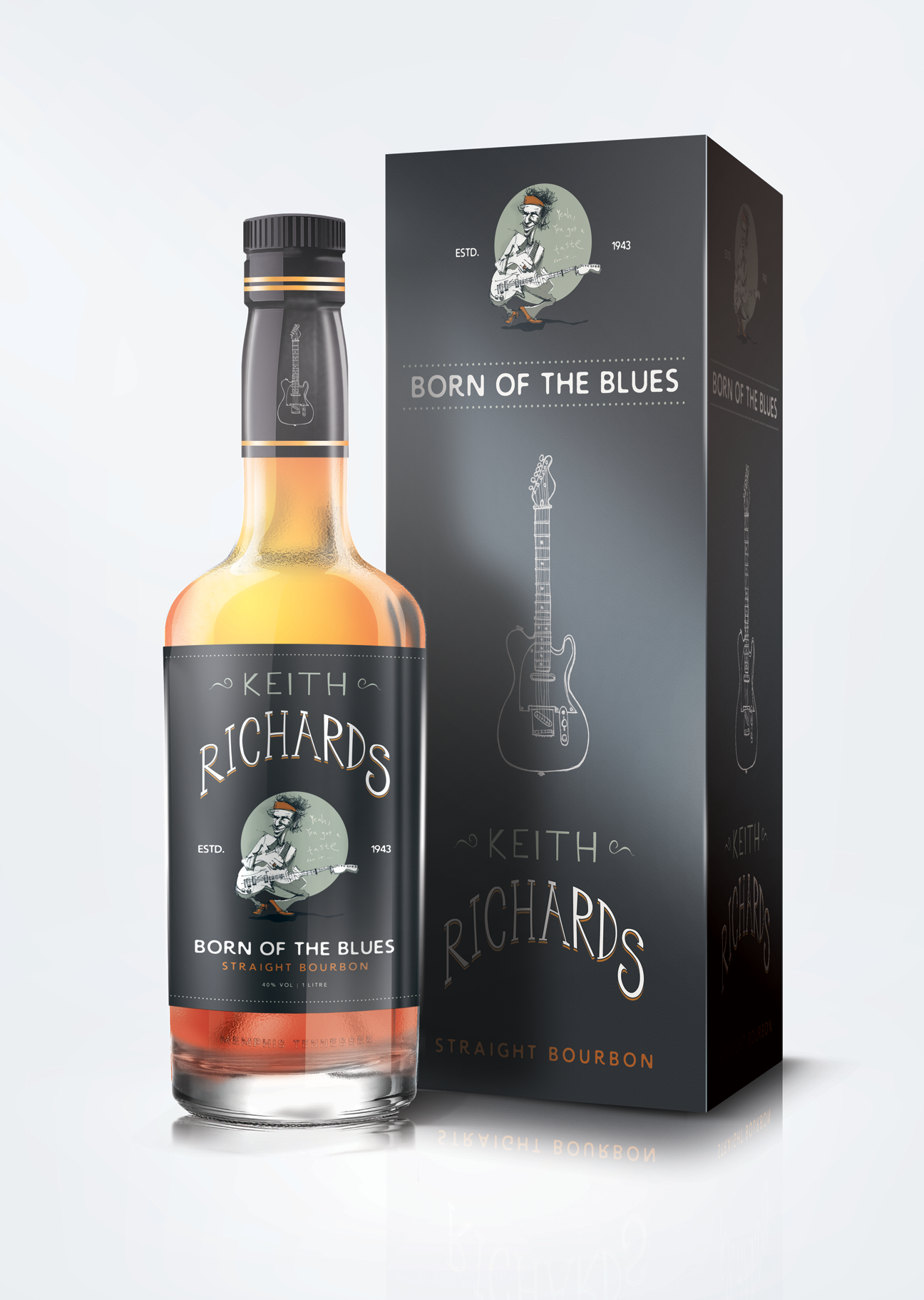
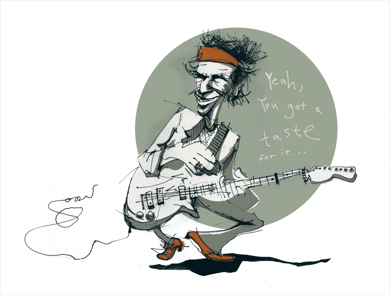
Another attempt to bridge the gap between illustration and design, here I’m experimenting with the idea of building a product label around one of my drawings. In this case, the legendary Keith Richards. I had originally considered a beer label but lets face it, where Keith is concerned it would surely have to be hard liquor.
The Process
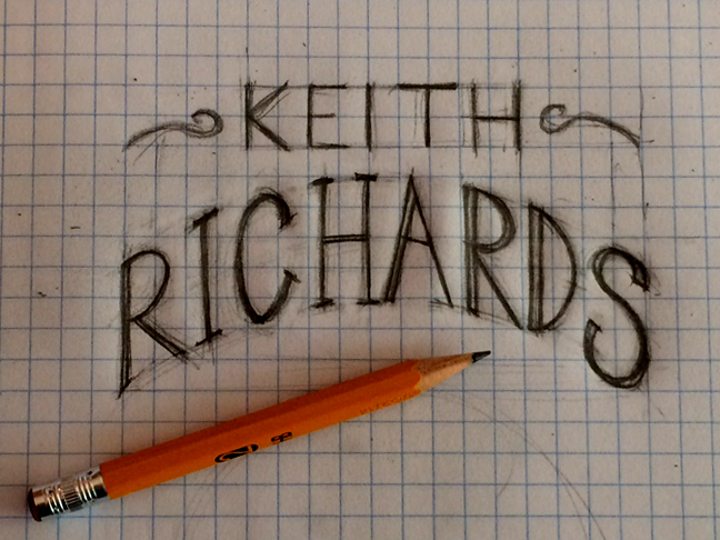
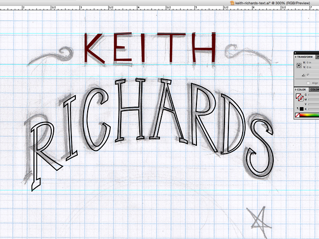
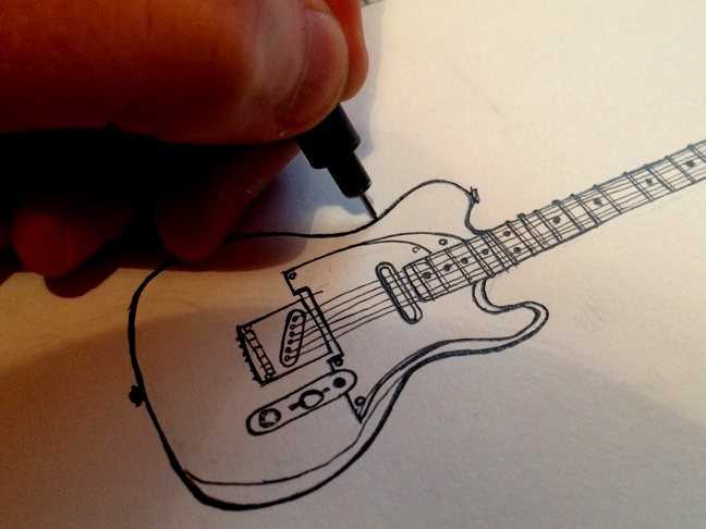
A work in progress. Quite possibly, this should still belong in the blog area but as I’m finding the process to be an interesting journey, I have chosen to give it pride of place in the portfolio section. Keep checking back over the next few days for more updates.
The Result
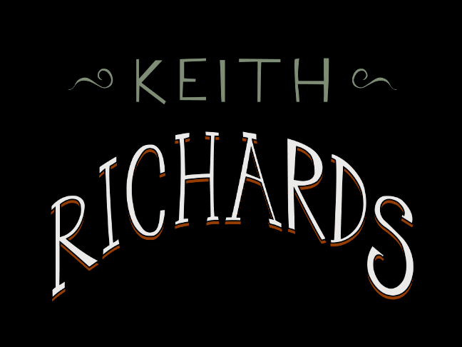
Well I say “result” but this is one of those personal projects that is clearly going to run and run. On reflection, I’m still not entirely sure about the title “Keith Richards”. It seems a little obvious. It might benefit from something a little more ambiguous. I’ll sit on it for now and have a think.
