1st Formations
Sharpening the message
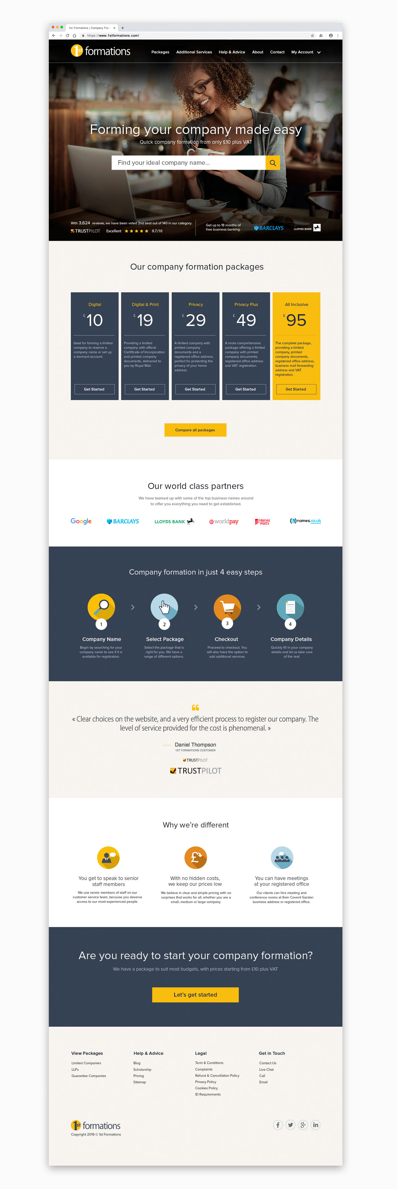
1st Formations are an online service aimed at making it easier for a person to register a company. Their current visual experience was in need of an update in order to create a fresher, more contemporary look.
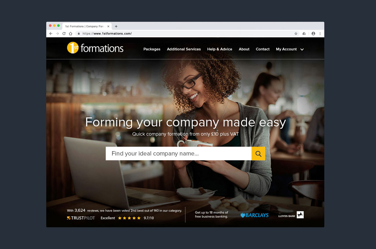
For this project, there was a particular focus on the home page where the majority of visitors would first enter the website.
The overall objective was to present a concise message that a customer would be able to act upon.
<!—start—>
MARKETING AREA
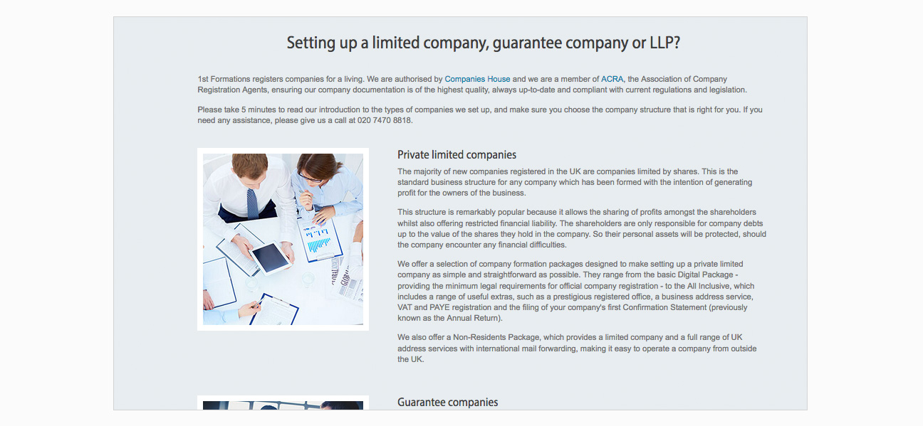
My initial impression of the online experience was that it was very text heavy which didn’t create a clear enough message to the customer.
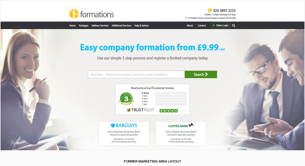
There were a lot of competing elements with no visual hierarchy.
What was the key message?
Where should the customer look first?
In terms of supportive imagery, it only seemed to add to the already cluttered layout.
Again, if I’m a visitor to the site, where should I look first?
In addition, the images didn’t seem particularly inspiring.
I couldn’t imagine many people identifying with the people being presented or indeed being particularly flattered to be associated with them.
<!—end of section>
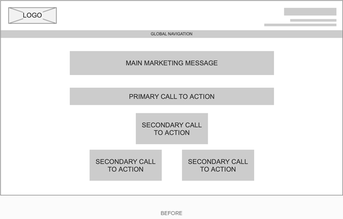
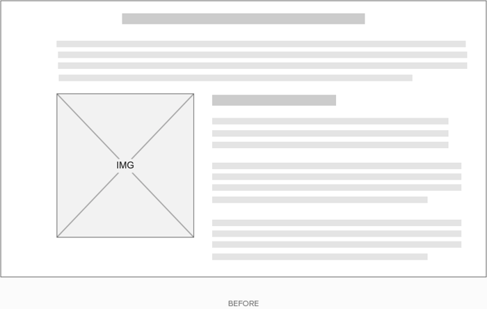
CLEARING THE CLUTTER
In order to start thinking about layout, I created a quick wireframe that would outline a different presentation of a similar amount of information but with a sense of hierachy.
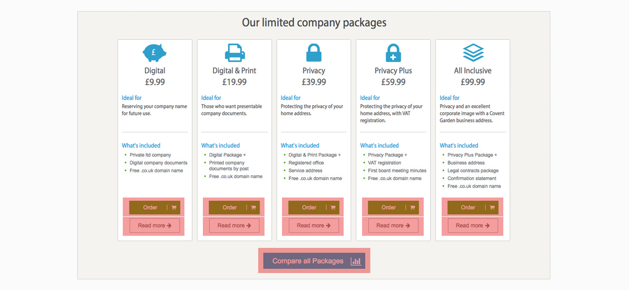
PACKAGES AND PRICES
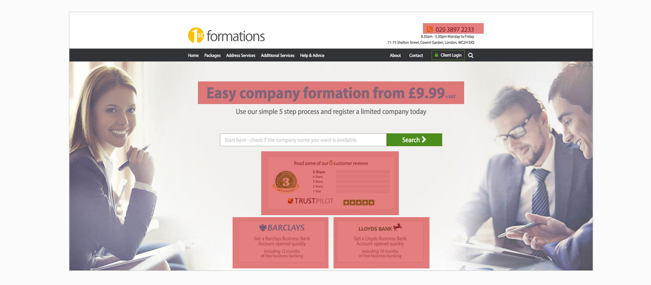
Scrolling down the page the trend of having a lot of different types of content within a relatively small area continued…
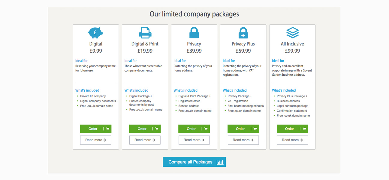
For example, with no less than eleven calls to action, where was a customer supposed to click first?
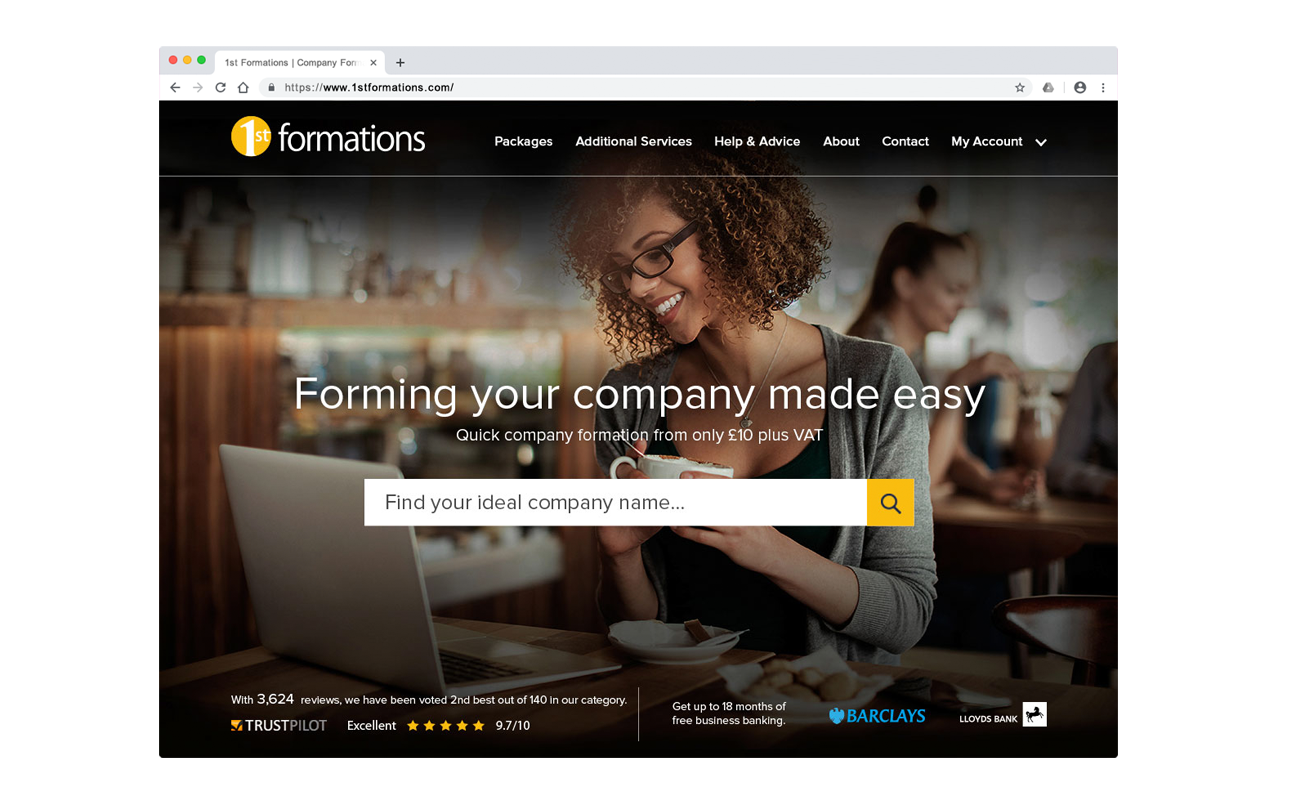
LAYOUT PROPOSAL
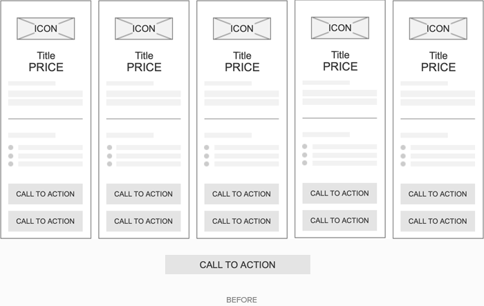
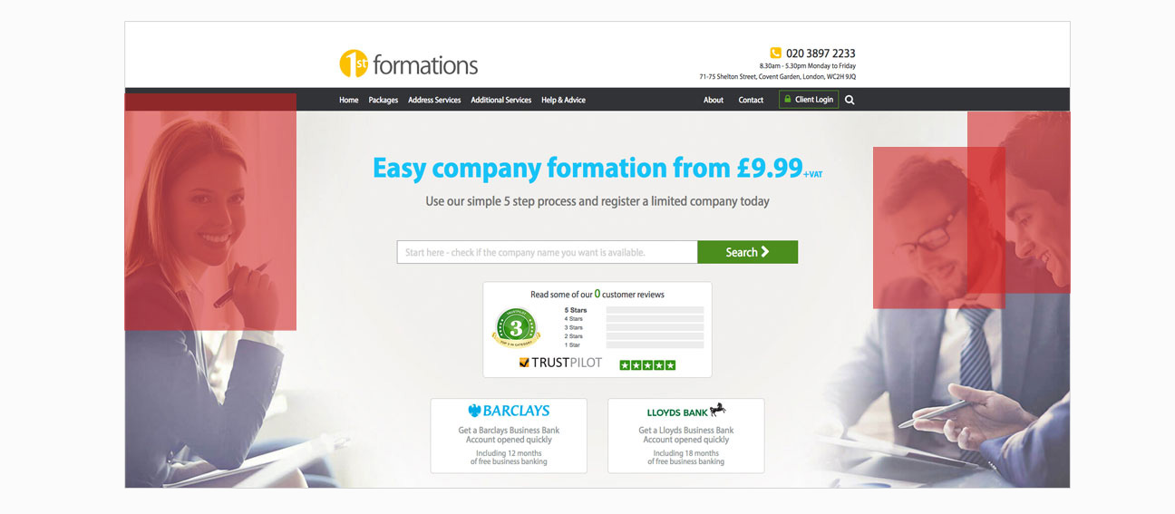
SUPPORTIVE INFORMATION
There was also a lot of additional information throughout the page which was hard to read and only served to ‘clunk up’ the rhythm of what was suppose to be a clear and concise message.
This might be acceptable on a deeper page but on the homepage, it’s a lot of information for a customer who might just be browsing around. It was also contradictory to the core message that company formation was ‘easy’.
It’s useful to remember that people don’t ‘read’ web pages as much as they ‘scan’ them.
With this mind, I proposed the following layout…
PROPOSAL
With the new layout, I wanted to focus on the main purpose of the page which was to help potential customers to create a company online.
All other elements such as reviews and additional offers, would take be secondary to the main marketing message.
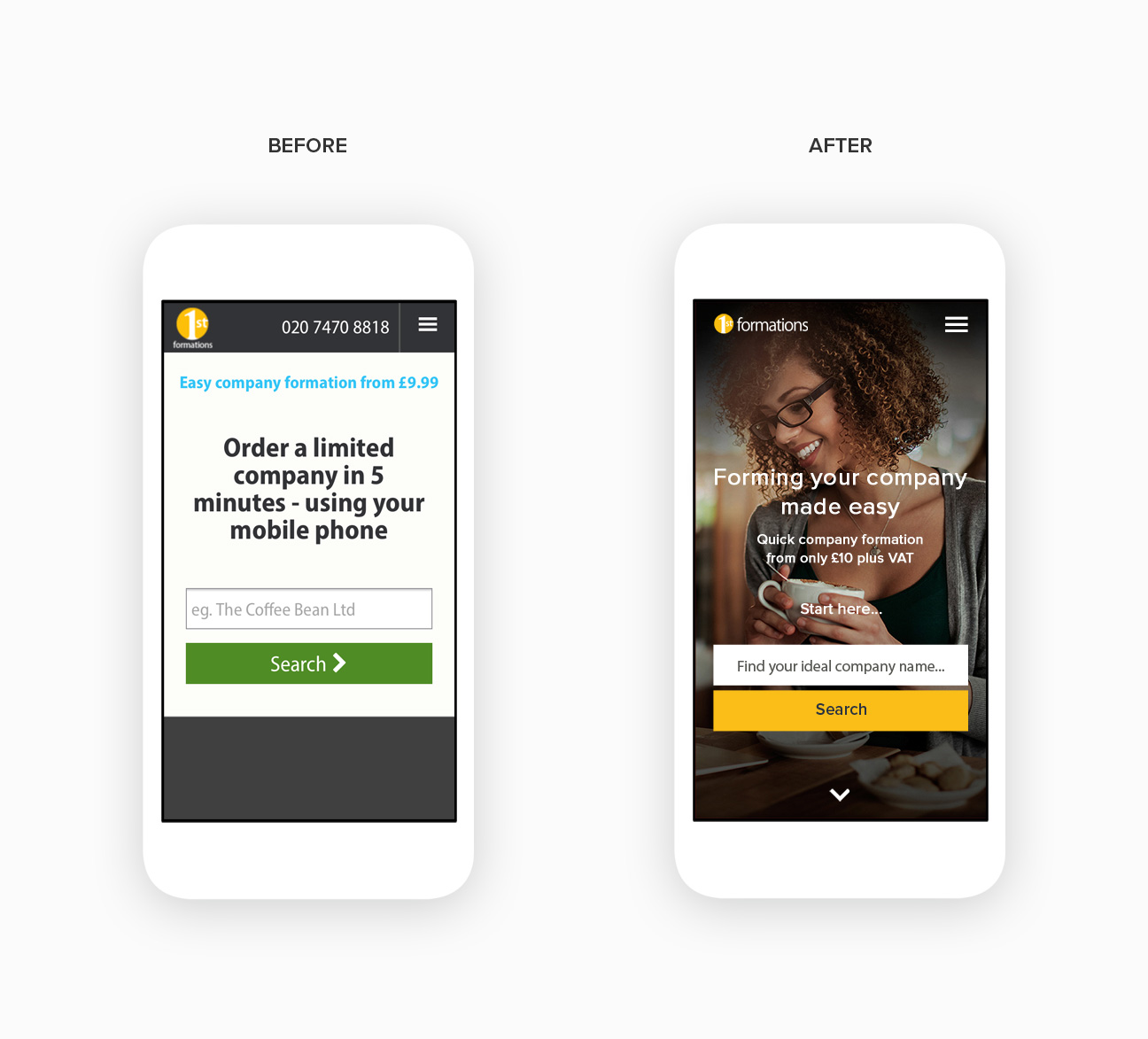
RESPONSIVE
With the mobile experience, it was also just as important to create an uncluttered view. Perhaps even more so once you take into account the limited space that you are afforded compared to a desktop experience.
OUTCOME
The end result was an updated look and feel that not only contributed to a drop in the previously high bounce rate of the website but also helped to increase the rate of commercial transactions due to the vastly improved customer experience.
THANKS FOR READING!
If you would like to find out more about this project or just want to chat UX in general, I would love to hear from you.