Franklin Investments
Reaching for better
The client, an industry leading financial investments company, had a challenge. Despite their online platform being very content heavy and full of information, any potential new investor looking to partner with the client would struggle to do so in it’s current form.
KEY CHALLENGES
Historically, Franklin’s customers have tended to conduct most of their business offline. However, most of their competitors were now offering robust digital platforms that would allow their user base to track all their investments online.
Franklin were looking to catch up quickly.
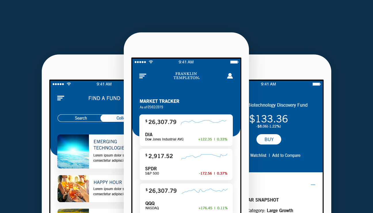
The solution was to create a new mobile app that would give their customers complete control with how they managed their investment portfolio’s. We would focus on two types of Franklin investor’s, the experienced and the inexperienced.
APPROACH
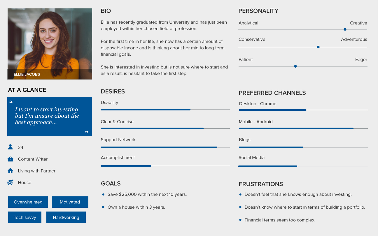
As part of the research phase, I created a series of user personas largely based on past customer interviews. With this approach, we were able to identify key pain points and understand the customers goals and motivations.
This gave myself and the team an understanding as to what problems we should be trying to solve.
PERSONA 1
PERSONA 2

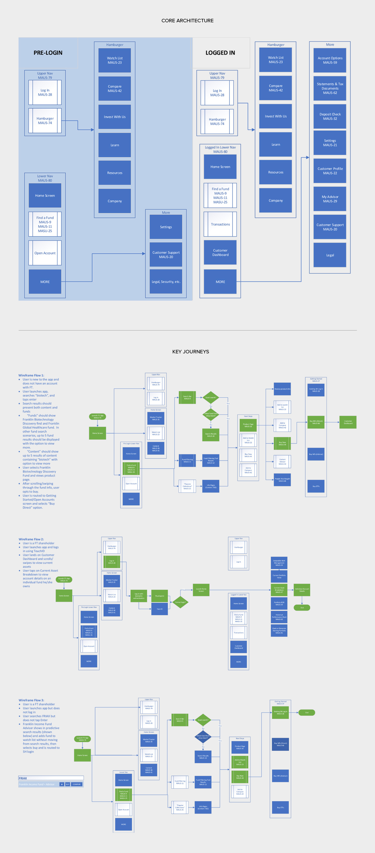
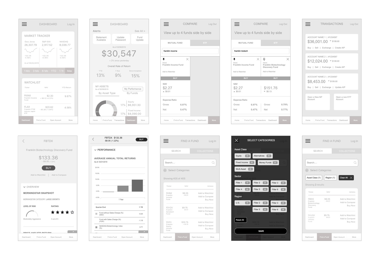
From that research, we were then able to start creating hypothetical user journeys and wireframes to help meet those objectives.
WIREFRAMES
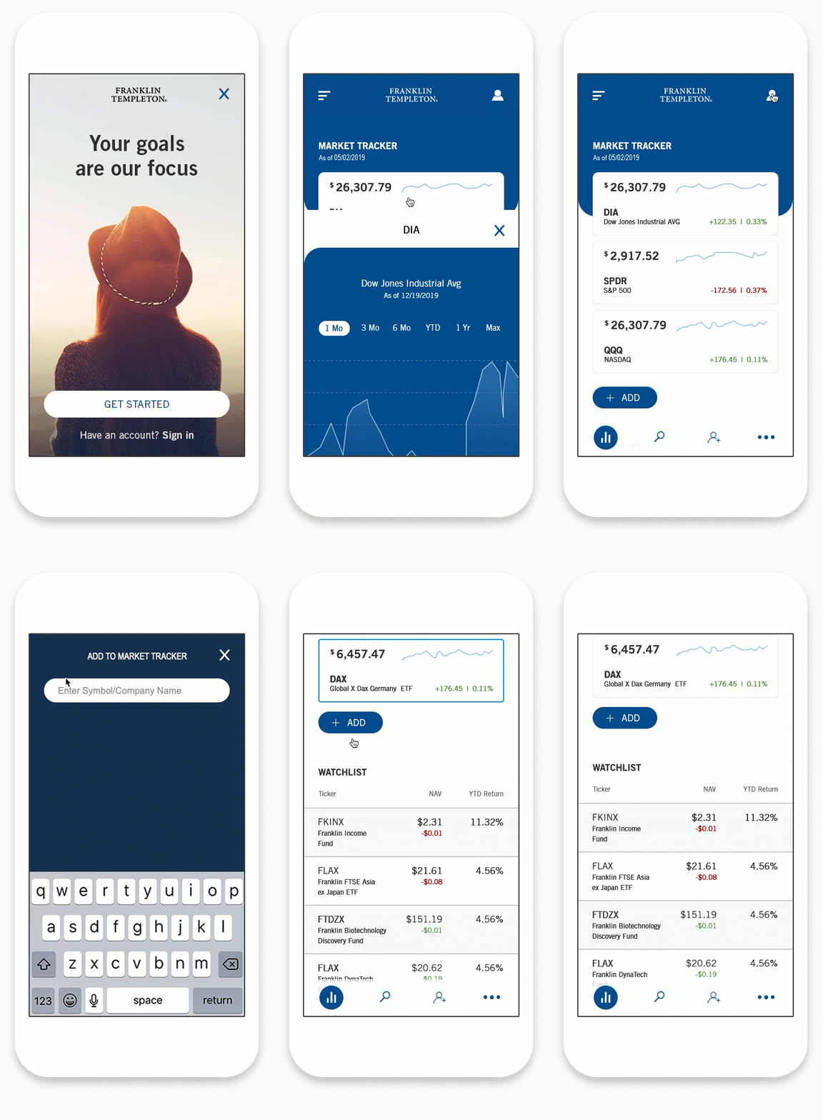
PROTOTYPE
OUTCOME
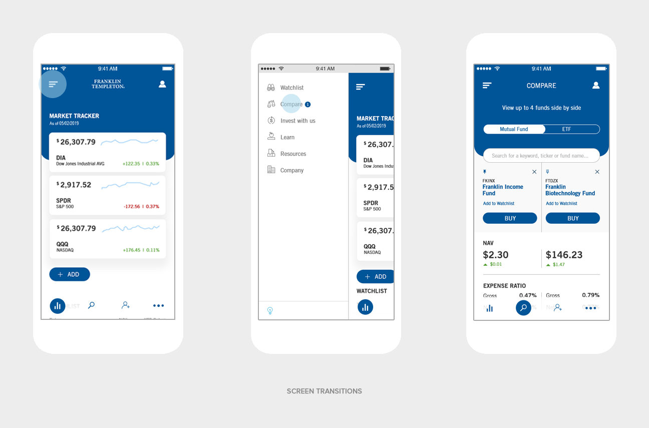
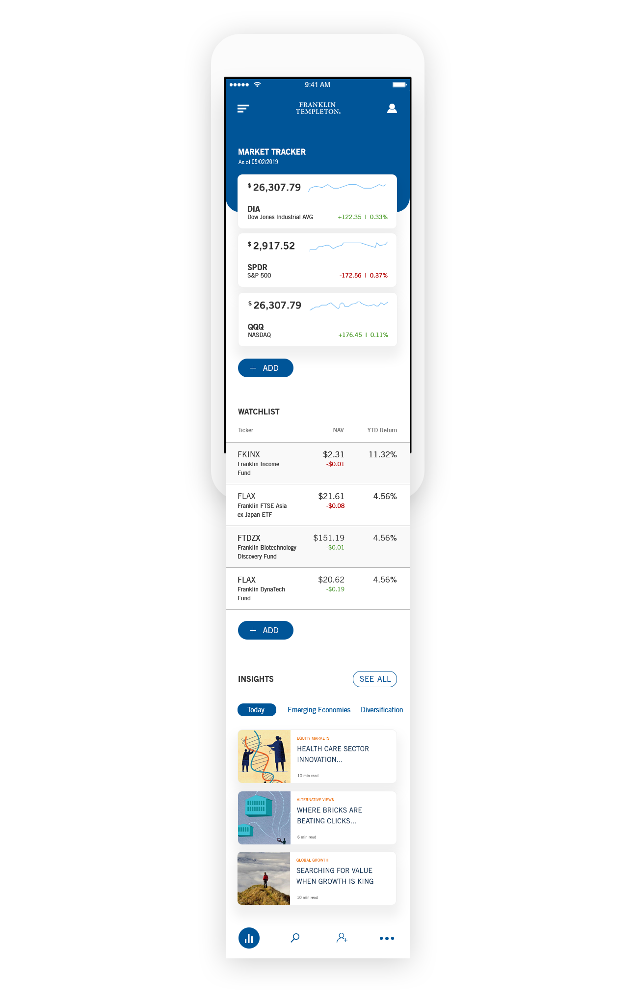
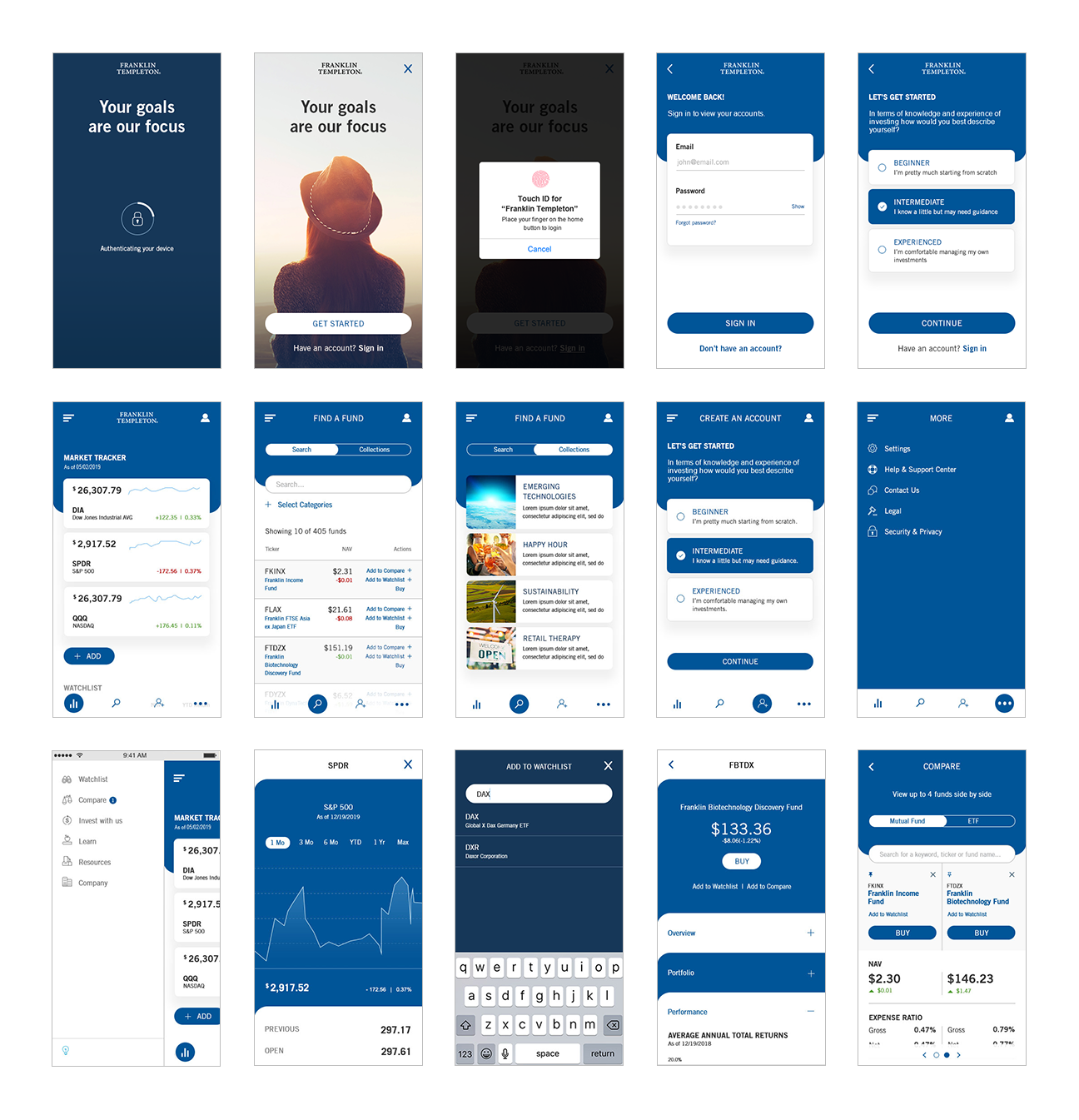
The new mobile app represents a new era for the client because of the new options that it gives to their customers such as the ability to easily compare funds, add new funds to their existing portfolio, create a watchlist and not least, be able to monitor their current investment portfolio’s online.
Future plans for the application are to include the ability to create multiple watchlists, view goal projections and build hypothetical portfolios.
I am also really excited about developing the new ‘Education Center’ section which will cater to the less experienced investor.
UI SCREENS
THANKS FOR READING!
If you would like to find out more about this project or just want to chat UX in general, I would love to hear from you.

