Quality Formations
Easier. Faster. Simpler
Quality Formations, an online service aimed at making it easier for a person to register a company, was in need of a major overhaul of not only their brand identity but their overall online user experience.
The aim was to improve the overall experience from the ground up, strip out all unnecessary elements and refine existing features with the goal being to present a clearer message overall.
KEY CHALLENGES
Quality Formations website had been performing very poorly in a commercial sense and had an unusually high bounce rate which the business was-understandably-keen to resolve.
In order to address both of these shortcomings, I set out to create a new brand identity along with an improved UX strategy.
APPROACH
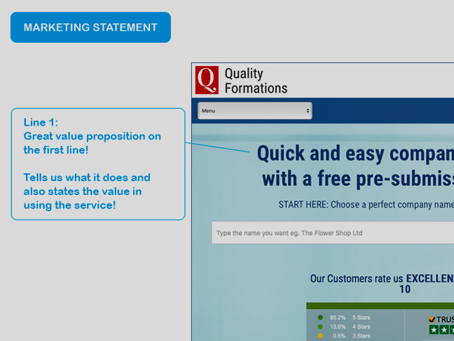
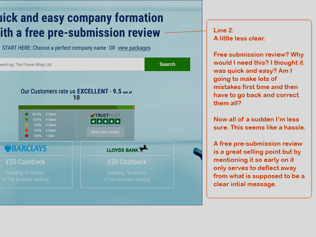
Although it was clear that there were many key usability issues with the current online experience, the wider issue was that the company didn’t seem to have any real sense of visual identity. There was no story being told to the customer as to what kind of company they were in terms of their values and who they were best suited to serve.
As part of the research and analysis phase I held a series of consultation sessions with the business in order to better understand their goals and how they saw saw themselves within the market which would influence the eventual design proposals.
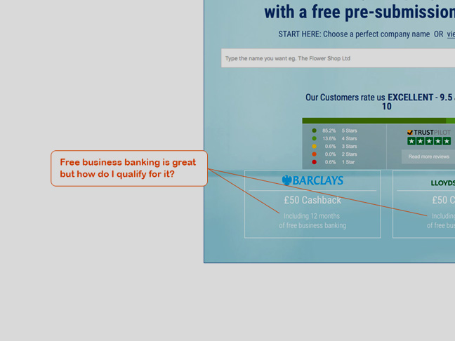
Auditing the existing website
In order to start to identify the current usability issues with the current website, I created an in-depth audit of the current home page. By doing this, I was able to clarify what the goals and objectives for the new platform should be.
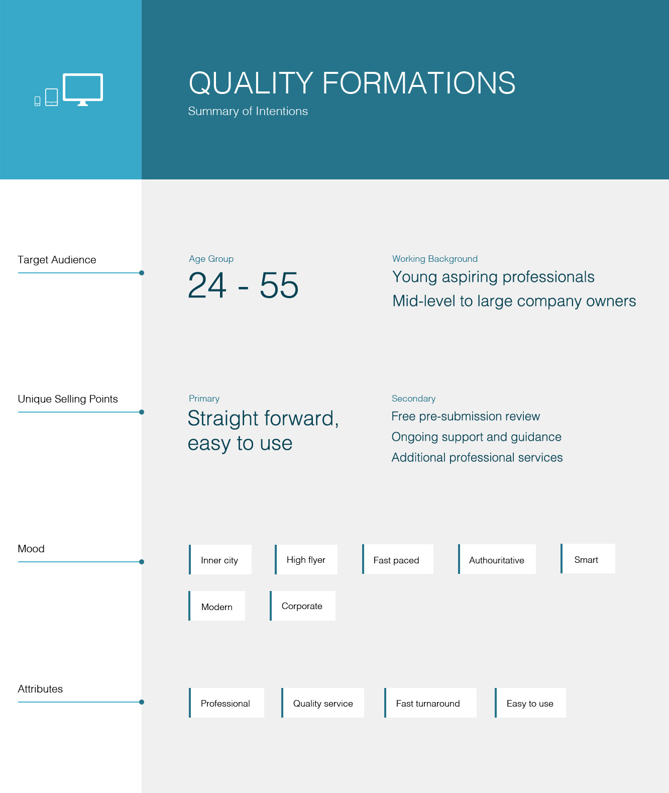
Identifying the typical user
Whilst still in the early stages of the project, it was crucial that I was able to create a clear picture of what a typical user would look like, what the unique selling points of the service were and what overall mood and message the website should convey.
Drawing from the research phase, I put together a summary that allowed me to focus my attention on what the goals should be for the new digital platform.
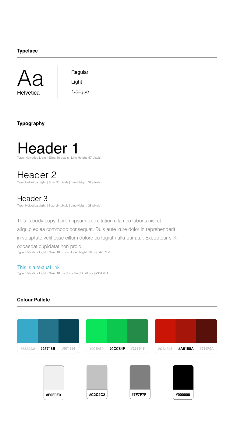
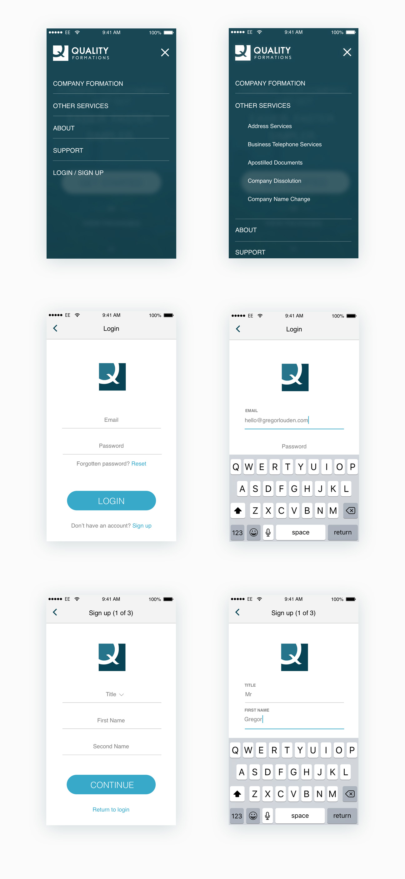
Developing a Brand Identity
As previously mentioned, what really struck me was the lack of any real kind of brand identity.
This was one of the first issues that I decided to address. Developing a recognizable visual identity is crucial in developing a sense of trust with the user.
![]()
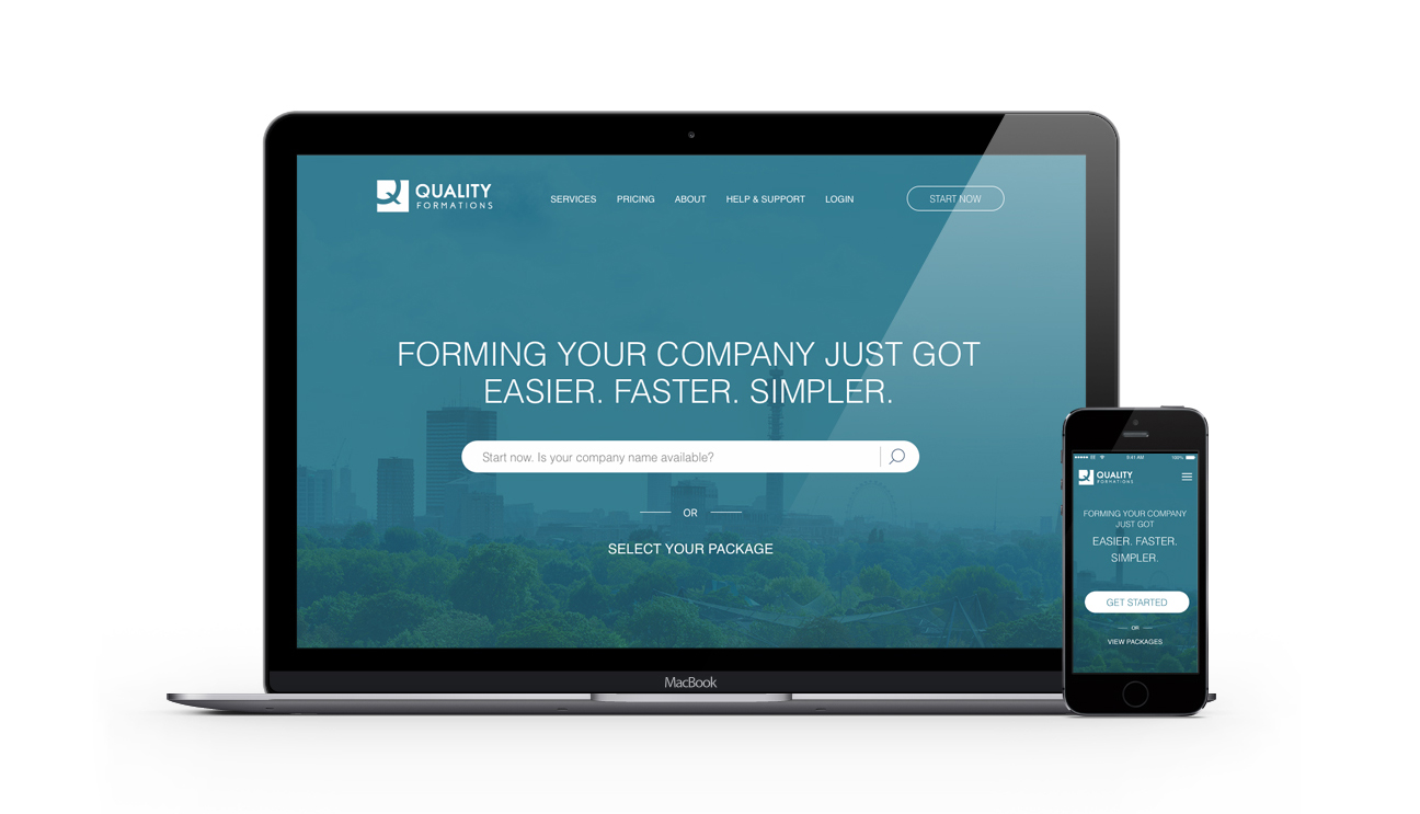
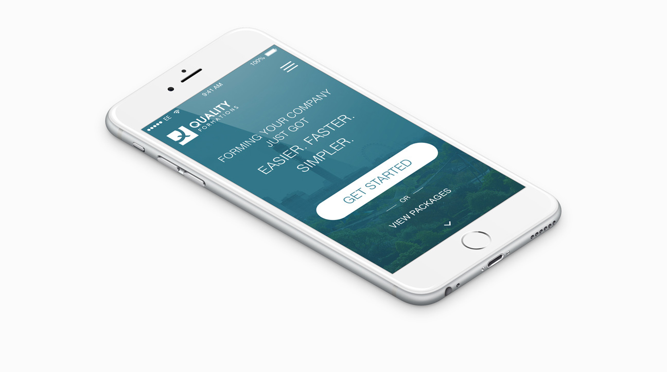
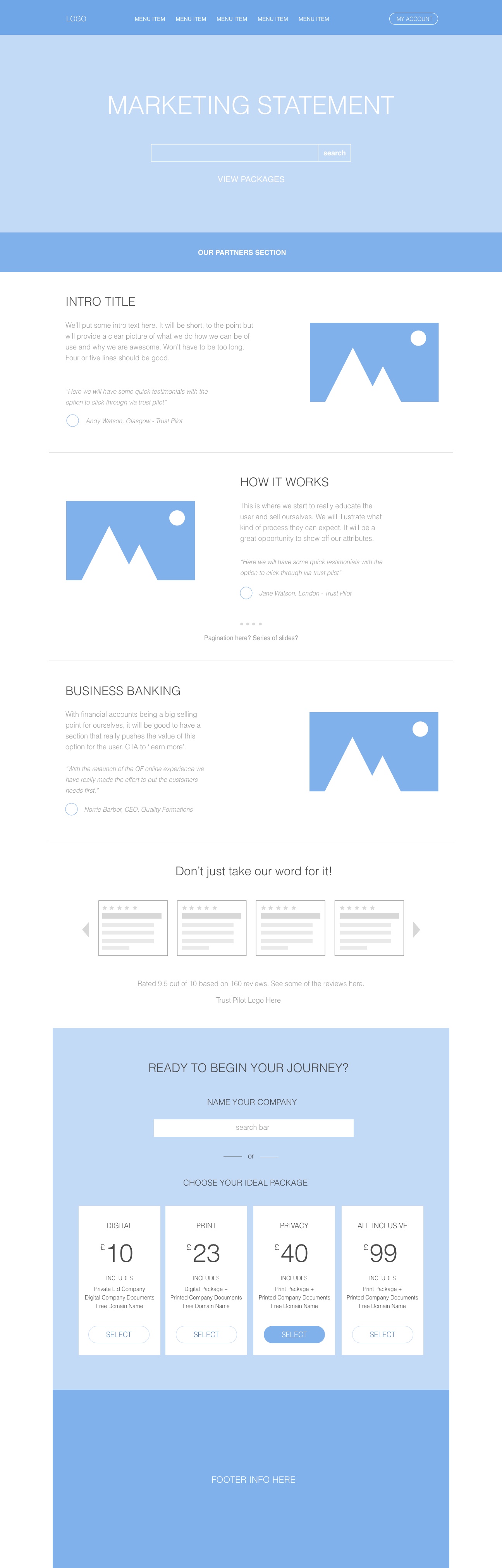
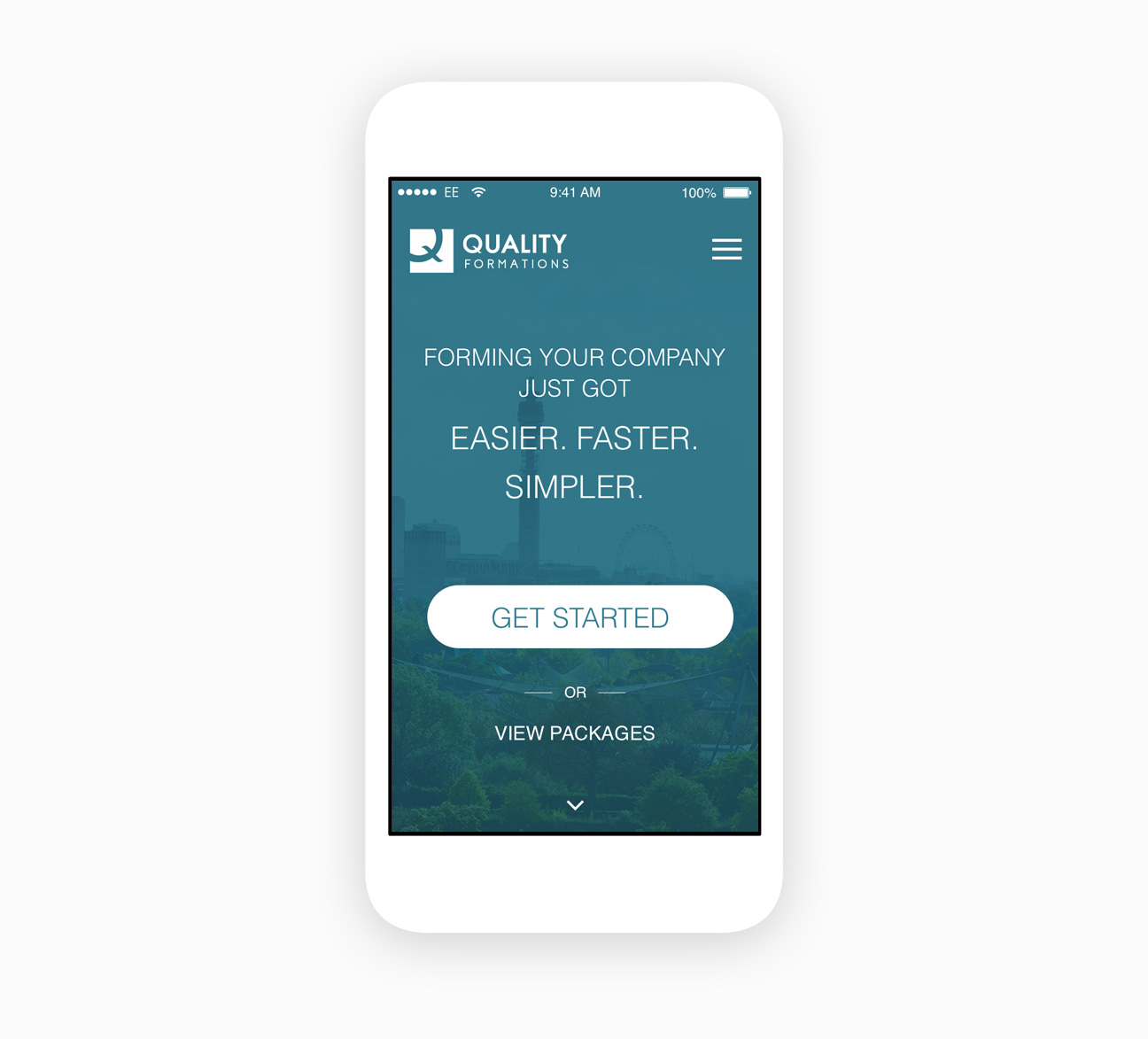
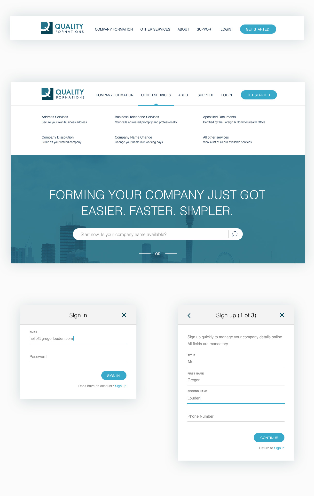
With the home page, I really wanted to tell the story of the service.
During the wireframing stage of the project, I experimented with different layout options before settling on an order that I felt worked best.
For example, where the pricing and packages had previously been shown above the fold, I instead opted to pace it out more, taking the time to showcase all the different selling points of the business instead of rushing in with the ‘hard sell’ which had felt a little pushy.
OUTCOME
By drawing upon what had been established during the discovery, brand development and wireframing stage of the project, I was now able to create a design that addressed many of the original issues with the online experience.

UI ELEMENTS
THANKS FOR READING!
If you would like to find out more about this project or just want to chat UX in general, I would love to hear from you.