Itison Hub: A Case Sudy
The Itison Hub is an online portal which to paraphrase their own words is, “a go-to place for up-to-date information on all a clients sales. They can also record when a voucher is used, read customer reviews, explore detailed analytics about their customers and review all their payment details.”
The consistent feedback on their existing prototype has been that while the hub “does it’s job”, it isn’t particularly warm and engaging in terms of design.
There was also the problem to solve of where the general overview section should go as it was felt that it was quite distracting where it currently was at the top of the first page. A new welcome alert would have to be developed which would contain all relevant information but not get in the way of what a user might be trying to do.
Two things for now then, design a fresher looking index page and create a new welcome alert.
Below is a case study which will document my working process and will explain why I arrived at the solutions that I did.
Sketching Ideas
Sketching a Way Forward
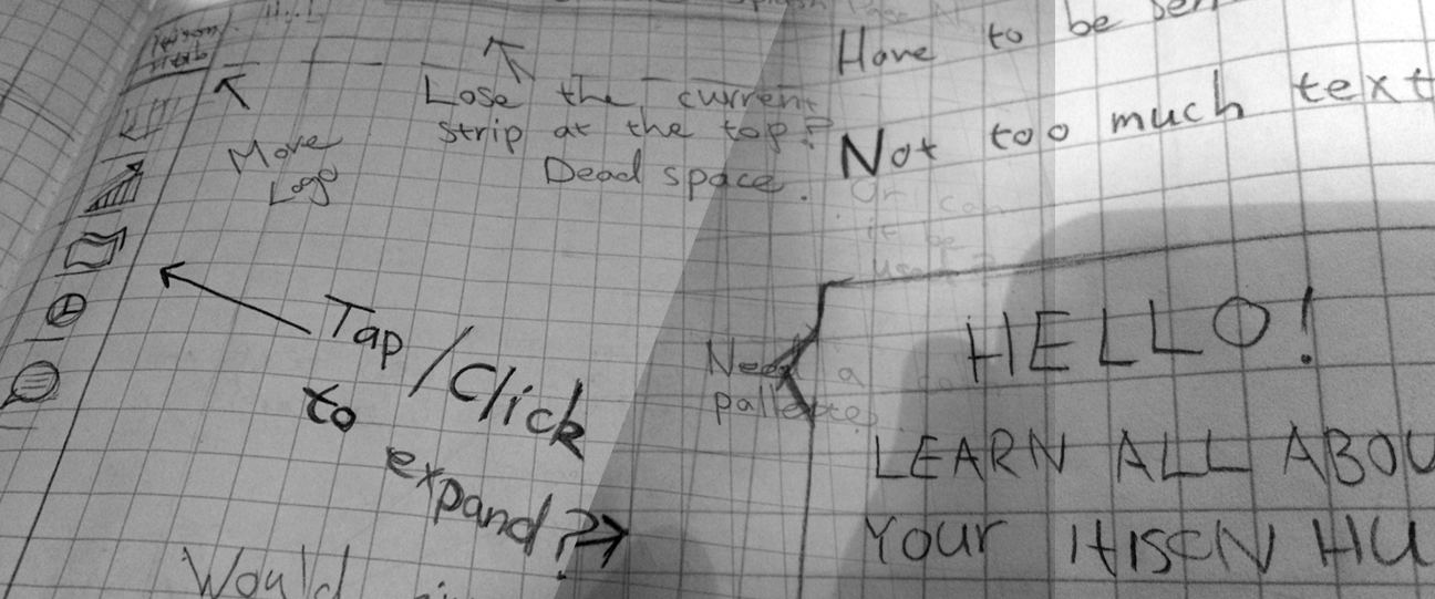
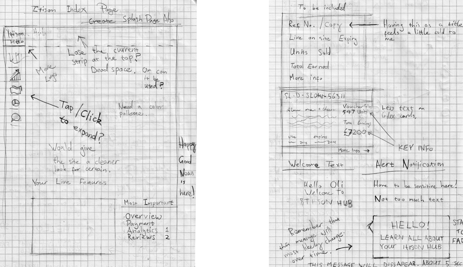
Always starting with pencil and paper, I wanted to get clear in my head, what the current issues were and what could be approved. First of all I wanted to create a definite hierarchy and remove any unwanted distractions and possible dead space which could be utilised better.
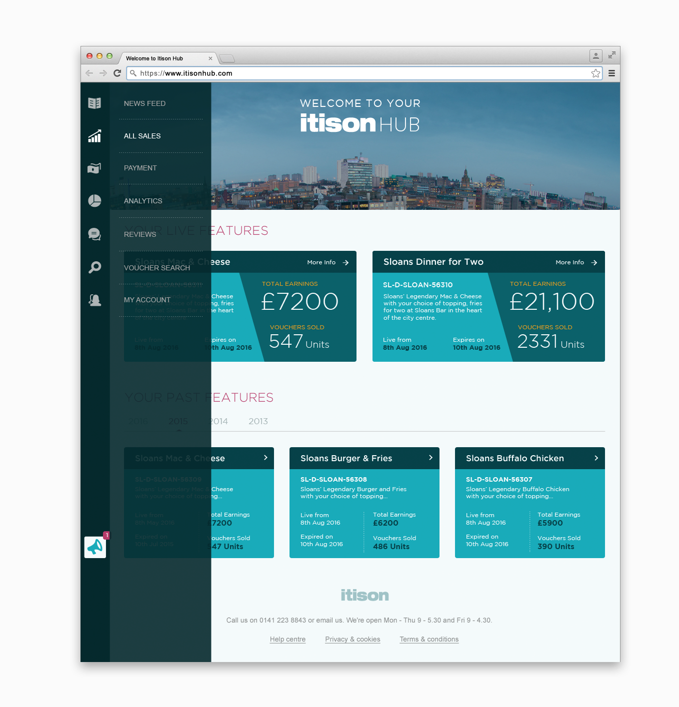
Navigation
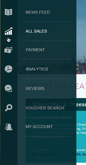
As one of my main goals was to give as much attention to the main focus (index cards) as possible I felt that I could free up some of the space a little by simplifying the menu by simply presenting the icons by themselves and having the the rest of the menu expand upon hovering.
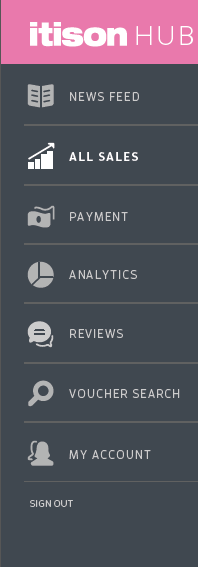
Admittedly, this approach can sometimes be unwise as you are effectively hiding content but as I felt that the existing icons were pretty strong and did a really good job of communicating all the different sections of the site I felt that it was a reasonable step to take.
Also, as collapsible menu’s are so much more common now (particularly where mobile is concerned) I was confident that the action would be intuitive enough.
I decided to trust the user on this one.

I also made the decision to place “Sign Out” within “My Account”.
Making it More Personal
The top strip at the top of the original design seemed a little redundant to me. Especially for the index page. Despite it being pretty common to have some kind of header at the top I didn’t think that this was enough of a justification for having it.
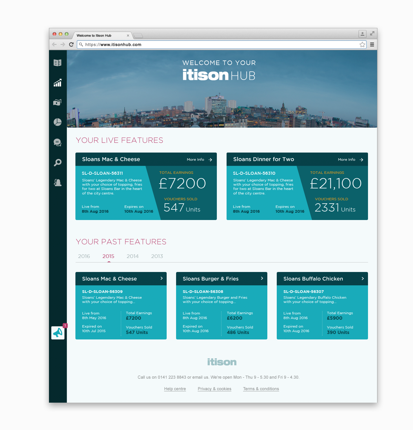
Instead, I decided to replace it with an image and a welcome text. This would be less distracting than a clump of overview text which I had now decided would be going else where.
The image would have be to be something specific or unique to the user. For example, here we are using Sloan’s bar which is located in Glasgow so I have opted for an aerial view of the city. The image wouldn’t be limited to a location however. There would be other options that could be developed through further discussions further down the line.
With a little more time I might have pursued the idea of creative an original clean looking illustration as opposed to a photograph to make it more unique. Something for the future perhaps.
Layout
Before I jumped into the design I would need to make sure that I was satisfied that the layout was how I wanted it.
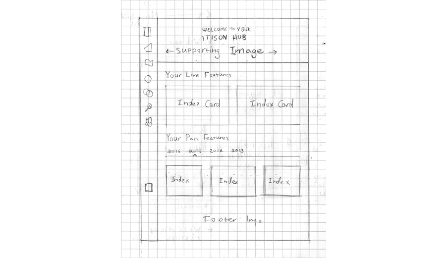
Index Cards
I wanted to keep them as basic as possible and not offer too many clickable options at first. The rest of the website will be able to do that.
Basic Layout
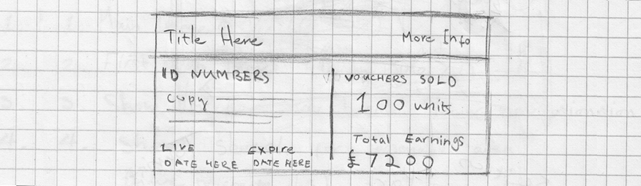
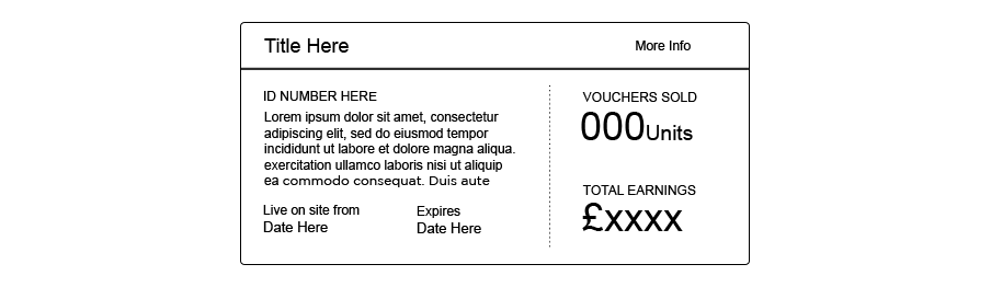
This was all the information I’d be using. Having the id number as the title of the index card was definitely a little cold looking so I opted to include the title of the specific deal.
Creating a Balance and a Hierarchy
At this point I was not so much concerning myself with color or any other finer aspects of design as I was with finding a balance for the content.
Bringing Out the Finer Elements
These first couple of attempts seemed clean enough but a little uninspiring. Nothing was really jumping out.
Better I think. Much bolder. Still a little too linear though.
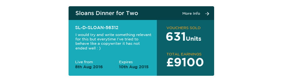
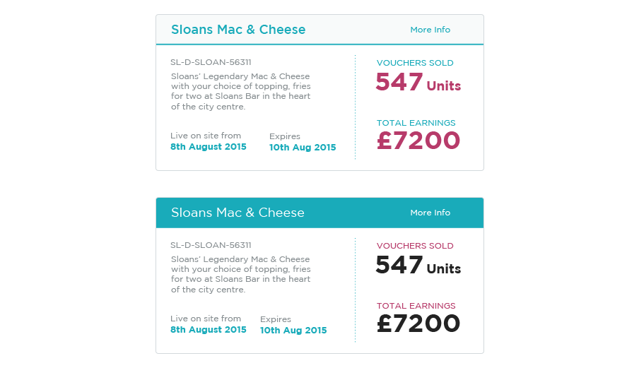
Final Version
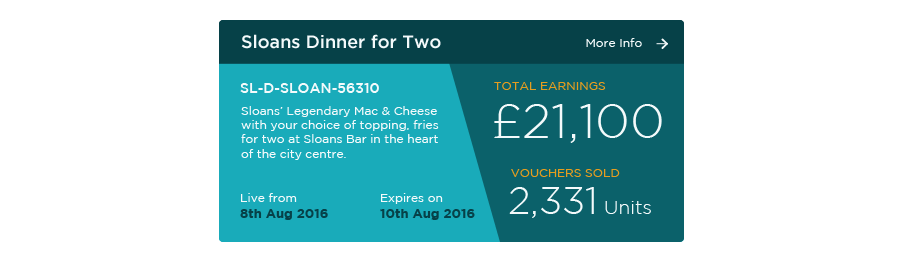
I went with this one. The diagonal line takes it away from the boxy look and also allows for space in order to further highlight the “total earnings”.
I also took the step of swapping the two numbers on the right so that the the final amount is at the top. Possibly a little unusual as you would normally expect that to be presented last but as it is surely the important figure, I felt that it needed to take pride of place at the top.
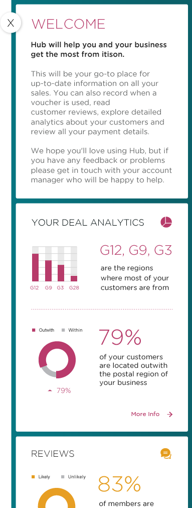
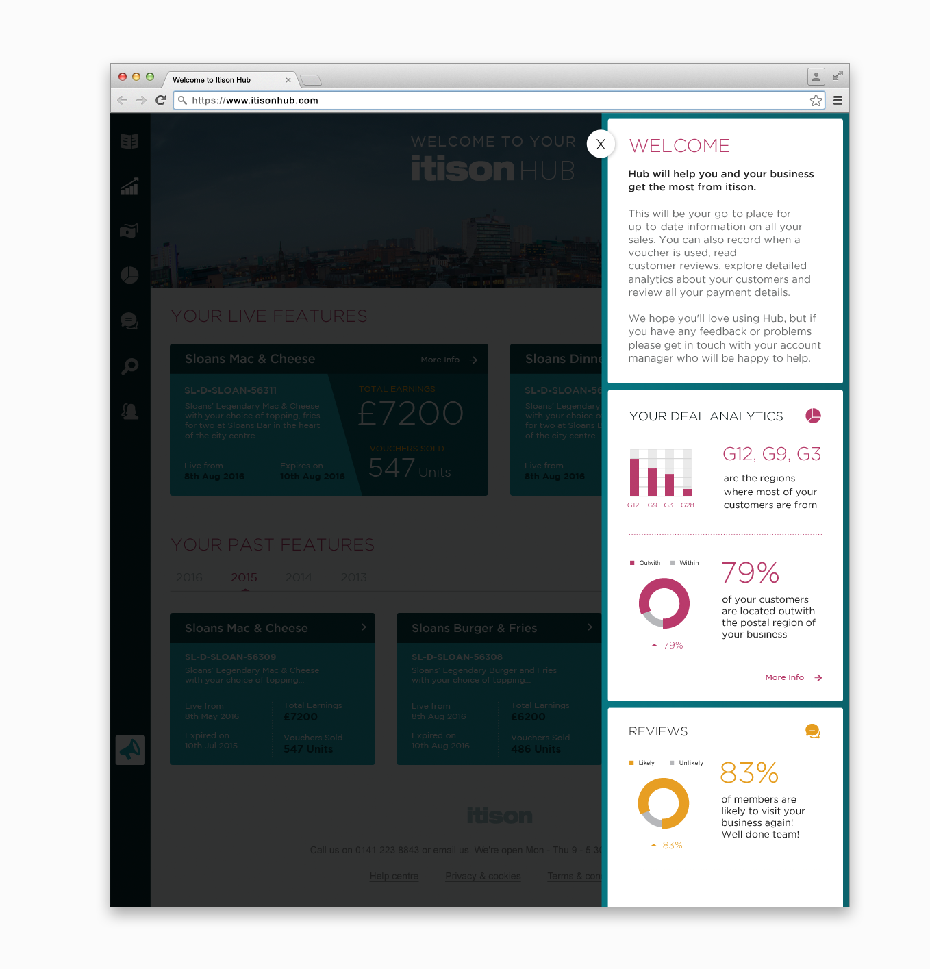
Welcome Alert
On to the second part.
To recap, the current alert was too text heavy, didn’t change whether the user was a first time visitor or not and wasn’t particularly engaging.
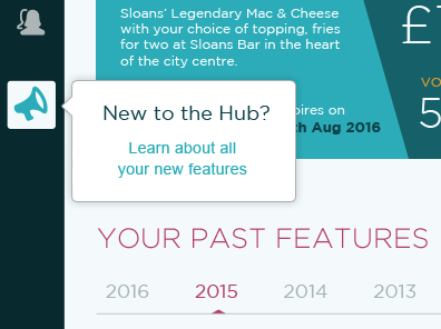
A possible solution that I settled on was to have the same information contained with an alert icon highlighted by an initial pop up.
This is where a designer has to tread sensitively. Pop ups that appear unprompted can have the ill effect of ruining an otherwise decent user experience.
If not presented subtly then they are often extremely invasive and even a little obnoxious.
An Invitation, Never an Instruction
I sketched out the following idea:
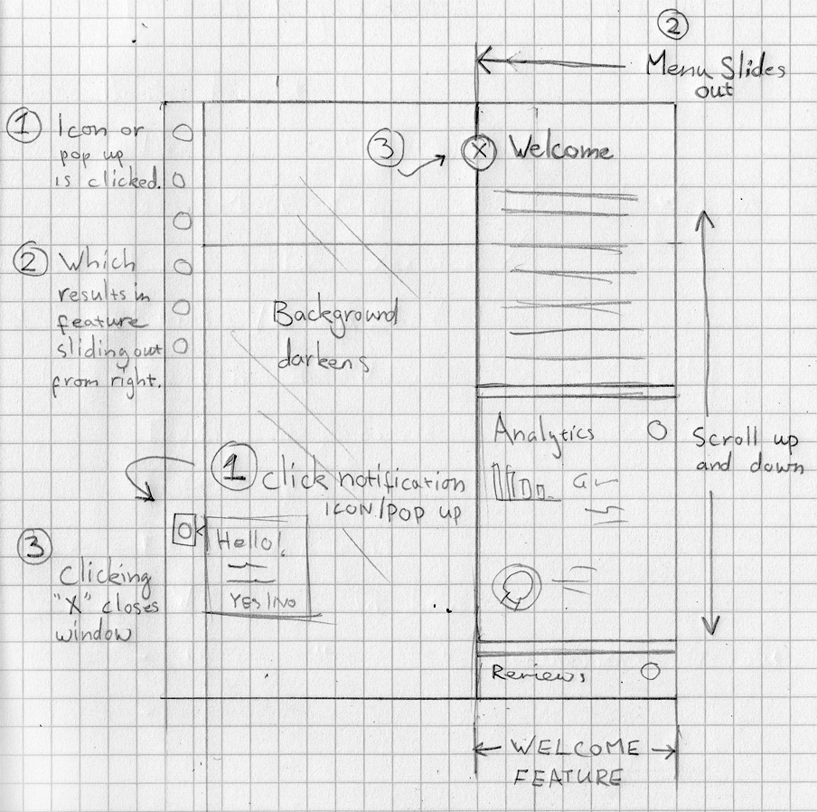
Alerts are typically found on the top right hand side of a page but for that reason I felt that it would be better to put it somewhere a little less obvious which might actually serve to highlight it.
The pop out itself would be short and to the point, disappearing after only five seconds, slowly fading during that time unless the user hovers over the top:
After the pop up faded, the icon would slide to the bottom of the web browser and remain fixed there. Fixed but always visible on the screen:

If the User Clicks the Icon
The welcome section will slide out containing the overview message and also other data that can give a further opportunity to promote some of the important features throughout the hub. To me, this is preferable than taking the user off the page entirely and then having them navigate all the way back should they want to do so.
A simple click on the “X” and the section slides back out.
To get a basic idea of how the alert would work try out the prototype.
Bear in mind that the action itself will be a lot more graceful in production with the menu sliding gently in from the right but the prototype will have given you an idea of the general flow.
The alert icon would be particularly useful for promoting other aspects of the site later on and not just a simple welcome message for a first time user that would quickly become obsolete.
Final Outcome
And below are all the elements put together. Click the images for the larger versions.
Closing Thoughts
The work created here would typically be the first round of a concept that would merely start the conversation with a client and we’d take it from there.
Hopefully a decent starting point.